Booking in two taps
A visitor picks who is coming and what the visit is for. The page shows the right visit, how long it takes, and a few open times, and carries their choices into the request form.
Concept project · Dental practice
Sourwood Family Dental is a fictional Mooresville practice I designed to show how a healthcare website can be warm, clear, and easy to book. It is built for the people who actually search for a dentist: parents choosing for their kids, new neighbors, and patients who have been putting it off. The business is made up, so this page is about the design thinking, not results.
The goal
Choosing a dentist is personal. People want to know whether the office will be kind, whether they take their insurance, and how hard it is to get in. If the website makes any of that difficult, they pick the next one.
This site answers those questions on the first screen and lets someone request a visit without making a phone call.

What I built
A visitor picks who is coming and what the visit is for. The page shows the right visit, how long it takes, and a few open times, and carries their choices into the request form.
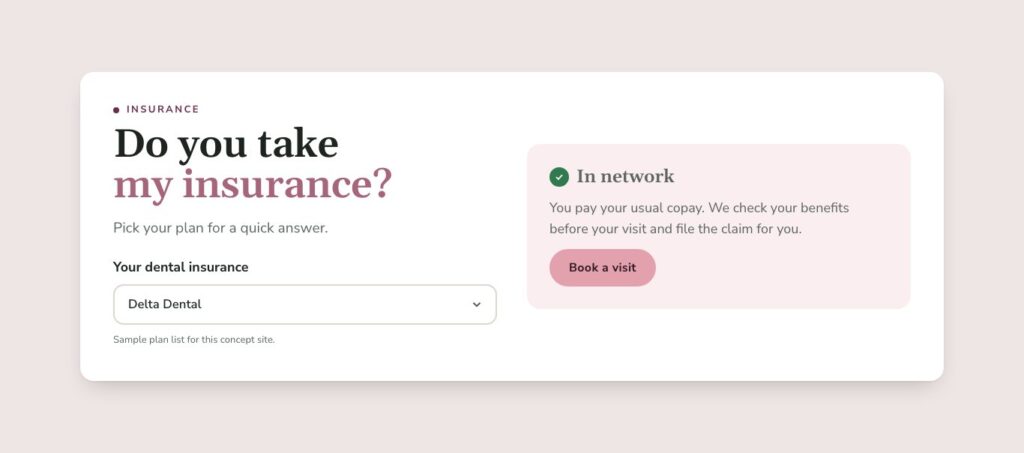
Pick a plan from a short list and get a straight answer, so the question that often stops people from booking is settled before they call.
Many people avoid the dentist because they are anxious. A calm section says it is okay and explains what the practice does to help.
The new patient page walks through the first visit step by step, with ways to pay and answers to the usual questions.
Feature
Most booking forms start with a blank page of fields. This one starts with two easy questions: who is coming in, and what is the visit for. The right visit appears, with a few sample openings, and the request form is already filled in.
The patient does not have to figure out what kind of appointment to ask for, and the office gets a clearer request.

Feature
For many families, insurance decides whether they book at all. The insurance check lets a visitor choose their plan and see a plain answer, such as in network, out of network, or not sure, with a clear next step.
It is a small feature that removes one of the most common reasons for hesitating.
On a phone
People look up a dentist from the couch or the school pickup line. The booking steps are large, rounded buttons that are easy to tap, and the call button stays within reach.
The whole site was designed on a phone first.

The idea behind it
Clear steps and a friendly tone take the pressure off people who are nervous about booking.
Insurance, cost, and what happens at the first visit are all covered where people look for them.
Healthcare sites often look cold. This one is meant to feel like the office does.
More concepts
A roofing contractor site built around storm damage, financing, and free inspections.
Read the case studyA winery site with a tap-to-explore vineyard map, a flight builder, and a lantern-light mode.
Read the case studyWhat I build for dental practices, and how pricing works.
See dental websitesTell me about your company and what you want the site to do. I will tell you which package fits and what it would take, no pressure.