Website Check-up · Sample reports
See what a Check-up looks like
Two sample reports for made-up businesses. One has a website that looks fine but is quietly losing customers. The other is clearly showing its age. A real Check-up reads just like these, written for your site.
Looks great, quietly leaking
A modern-looking site with problems you can't see from the outside.
Read the sample Sample 2 · Roofing contractorGood business, tired website
A site that was fine in 2012 and now costs the business calls.
Read the sampleBoth businesses are made up, and so are their websites. The findings and numbers are examples, so you can see what a Check-up covers and how it reads.
Sample 1 · Family dental practice
Looks great, quietly leaking
Fernbrook Family Dentistry (sample)
The short version
This is a nice-looking website. The photos are bright, the colors are calm, and it feels like a modern practice. If you looked at it on your own computer, you'd probably think it was fine.
The problems are the parts you can't see. Three service pages are hidden from Google by a leftover setting. There's no way to book or call from the top of the page. And nothing tells the practice how many people found them, called, or filled out the form.
- Look and designWorking
- Booking and callingFix first
- Behind the scenesFix first
- SEO basicsFix first
- PhonesNext
- SpeedNext
- Trust and proofNext
The homepage, marked up
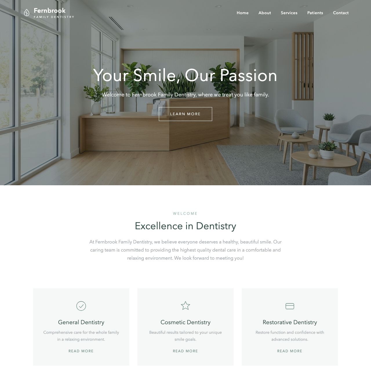
- No phone number or booking button The menu has five links and none of them is "Book." The phone number only appears in the footer.
- "Your Smile, Our Passion" Pretty, but it could be any dentist anywhere. It doesn't say family dentistry, the town, or new patients welcome.
- "Learn More" The only button on the screen goes to the About page, not to booking.
- A 2.6 MB hero photo The biggest reason the page is slow on phones. It can be a tenth of the size and look the same.
- Light gray text Hard to read for many people, and it fails accessibility contrast guidelines.
- Three "Read More" links Generic links tell Google and screen readers nothing, and two of these pages are hidden from search.
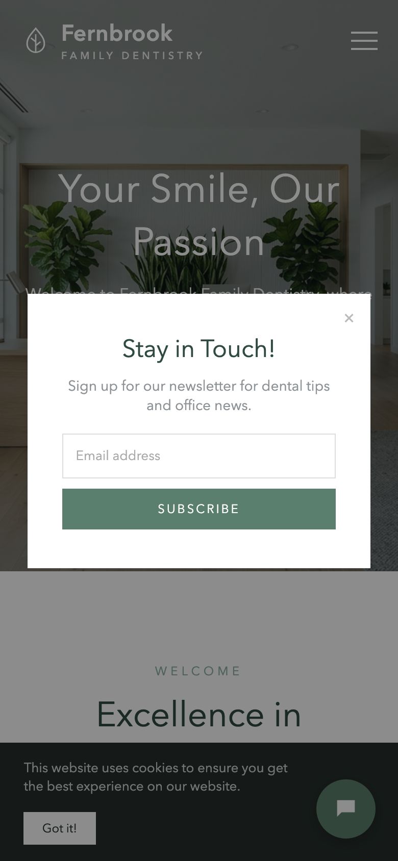
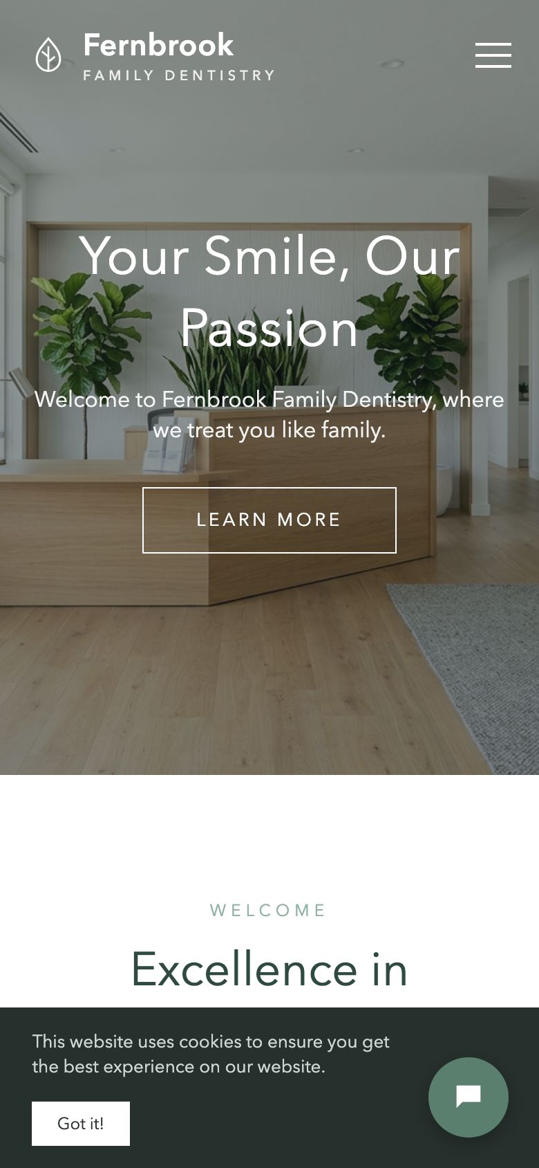
On a phone
- A newsletter pop-up on arrival It covers the page before a new patient knows anything about the practice.
- Everything is behind the menu The phone number, booking, and insurance info are all hidden behind three lines.
- Cookie bar and chat bubble Together they cover the bottom of the screen, right where a "Call" button usually goes.
to call this practice from a phone: close the pop-up, open the menu, tap Contact, then find the number. The goal is one tap from any page.
Behind the scenes: the parts you can't see
| Check | What I found | Result |
|---|---|---|
| Google can see your pages | Three service pages are set to "noindex," which tells Google not to show them. Often left on by accident after a site is built. | Problem |
| Page titles | The homepage title is just "Home," which is what shows in Google results. | Problem |
| Contact form | The form sends, but its thank-you page is missing and patients get no confirmation. | Problem |
| Broken links | "New Patient Forms" opens a missing PDF, and 3 other links go nowhere. | Problem |
| Tracking | Analytics is installed, but calls, form fills, and bookings aren't counted. | Watch |
| Business details for Google | No structured business info (hours, address, "dentist") for Google to read. | Watch |
| Image descriptions | None of the 14 images has a description for screen readers or Google. | Watch |
| Software updates | 9 plugin updates are waiting, including one security fix. | Watch |
| Security certificate | Valid, and every page loads securely. | Good |
My honest take
You don't need a new website. You have a good-looking site with a handful of settings and small changes standing between it and more booked appointments.
Sample 2 · Roofing contractor
Good business, tired website
Tallow Creek Roofing (sample)
The short version
Tallow Creek has real strengths: 20 years in business, a local family crew, financing, and storm and insurance work that many roofers don't offer. The website hides almost all of it.
Most people looking for a roofer are on a phone, often right after a storm. On a phone, this site shows a shrunken desktop page where the text is too small to read and the phone number can't be tapped.
- Phones and computersFix first
- SpeedFix first
- Getting in touchFix first
- Pages and messagingNext
- SEO basicsNext
- Trust and proofNext
- Content and factsWorking
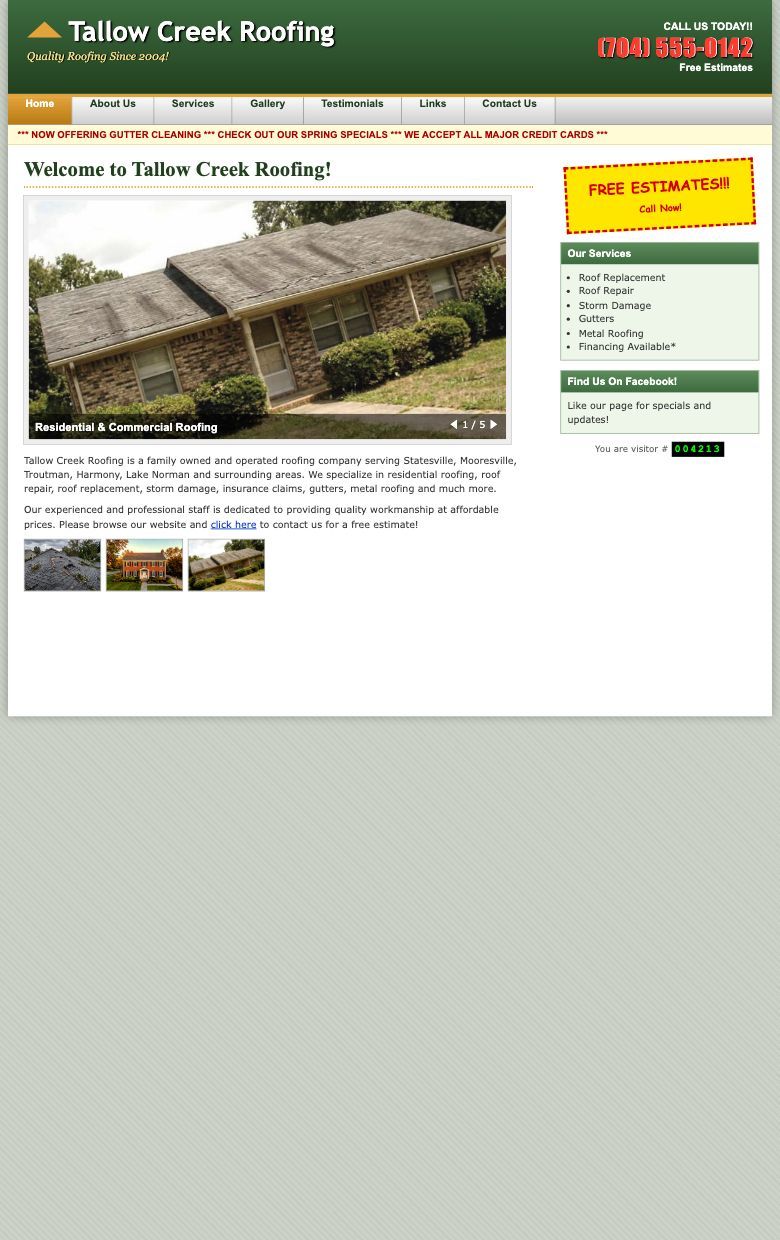
The homepage, marked up
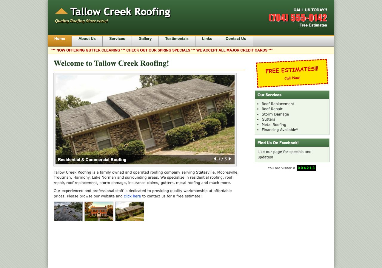
- The phone number is a picture of text Easy to see, but on a phone it can't be tapped to call.
- A "Links" page Pages like this date a site quickly and send visitors away.
- A scrolling banner with old news "Spring specials" in October makes people wonder if the business is still open.
- "Welcome to Tallow Creek Roofing!" The most important headline on the site says nothing about what you do or where.
- A five-photo slideshow Most people never click past the first slide, and the photos slow the page down.
- "Click here" The only call to action is a small link at the end of a paragraph.
- "FREE ESTIMATES!!!" A good offer, but it isn't a button, so there's nothing to tap.
- Visitor counter A quick sign that a site hasn't been touched in years.
On a phone
- The whole page shrinks to fit The site is a fixed 960 pixels wide, so a phone shows a tiny copy of the desktop page.
- Text at a third of its normal size Nobody pinches and zooms to find a roofer. They tap back to Google and call the next one.
- Nothing big enough to tap The phone number, the menu, and "click here" are all too small to hit with a thumb.
to load the homepage on a phone. The goal is under 3 seconds, and most of the wait is five full-size slideshow photos.
From the fix list
- Make the phone number tap-to-call on every pageQuick
- Add a short estimate form and a "Get a free estimate" buttonModerate
- Resize and compress all photosQuick
- Rebuild the layout to work on phonesBigger project
- Rewrite the homepage headline to say what you do and whereQuick
- Give storm damage and insurance claims their own pageModerate
The full report has 13 fixes, in order, with who can do each one.
My honest take
The quick fixes are worth doing right away. The phone layout is the real problem, and it's the main reason a new site makes sense here.
Every Check-up
What you get for your site
A review on phones and computers
I go through your site the way a customer would, and the way Google would.
The behind-the-scenes checks
Search settings, page titles, forms, tracking, broken links, and updates.
A written fix list
In plain English, ordered by what will make the biggest difference.
A walkthrough call
We go over the results together so you know exactly what to do next.
Want one of these for your site?
$350, one-time. If you hire me to build a new website within 60 days, the full fee is credited toward it.